
Comparing R Graphic Packages - ggplot2 vs. plotly
After starting this blogging section of my personal website I set a lofty goal to try to have a new blog post each week. However, reality set in quickly and this is now my first post in nearly 5 months. Despite having more time available at home due to the COVID-19 quarantine and safer at home mandates in Los Angeles County1, I continually found ways to avoid writing new posts.
That was until today. I recently found myself motivated to write this new post as I have been working with different graphics packages in R as part of my dissertation work. In particular, I wanted to compare two popular R packages for creating graphics: ggplot2 and plotly.
Motivating Example
To demonstrate some of the abilities of these two packages I will use my own R package, rwindow.baseball, to pull several baseball statistics and create relevant graphics for attendance figures for the Los Angeles Dodgers. I first start by installing the rwindow.baseball package.
# install.packages("devtools") #uncomment if devtools has not been installed previously
devtools::install_github("williazo/rwindow.baseball")
Now I will pull2 attendance figures for the Los Angeles Dodgers from the 2015-2019.
lad_dt <- tm_standings_schedule("LAD", start_year = 2015, end_year = 2019)
From this data we may be particularly interested to see attendance patterns over time with respect to the following objectives.
Objectives
- Graph home attendance for each Dodger game from 2015-2019
- Estimate trend lines for each year
- Identify attendance on July 4th as special date of interest
In order to achieve these three objectives we will first pre-process our data before passing it off to our respective graphic packages. I use piping features from the dplyr package to process the data which is also a component of the tidyverse collection.
library(tidyverse)
lad_dt <- tm_standings_schedule("LAD", start_year = 2015, end_year = 2019)
lad_dt <- lad_dt%>%
  filter(home_gm==1)%>% #only including home games
  group_by(Year)%>%
  mutate(home_gm_num=row_number())%>%
  ungroup()
lad_dt$july_forth <- ifelse(grepl("Jul 4", lad_dt$Date), 1, 0)
Our data is now ready to be used to generate our graphics of interest.
ggplot2
This is the most common graphics package outside of base R graphics. It is the result of the work of one of the most well-known contributors to R, Hadley Wickham, and a key component of the increasingly popular tidyverse collection. ggplot2 has made it incredibly easy and flexible for users to create high quality graphics using a consistent syntax. For a gentle introduction to some of the features and capabilities of ggplot2 I would point users to Chapter 3 of Hadley’s “R for Data Science” book available for free at https://r4ds.had.co.nz/data-visualisation.html that outlines the grammar of graphics as envisioned by its creator.
We achieve our objectives using ggplot2 using the following code
library(ggplot2)
ggplot(data=lad_dt, aes(x=home_gm_num, y=Attendance, group=Year, color=Tm))+
  geom_point()+
  geom_line()+
  facet_wrap(~Year)+
  xlab("Home Game #")+
  scale_x_continuous(breaks=seq(1, 81, 10))+
  ylab("Total Attendance")+
  stat_smooth(method="loess", se=FALSE, color="black", linetype=2)+
  scale_color_manual(name="Team", values="#005A9C")+
  geom_vline(data=subset(lad_dt, july_forth==1), aes(xintercept=home_gm_num), col="red", linetype=3)+
  theme_bw()+
  guides(color=FALSE)
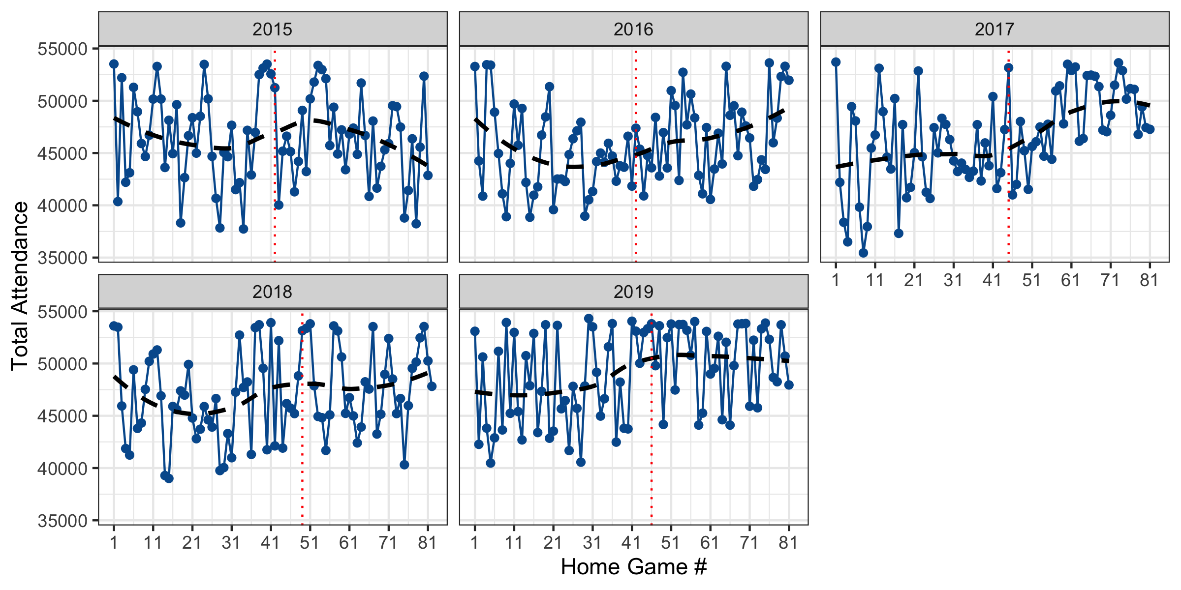
From this graph we can see that the home attendance has been consistently been high over the past 5 years. There was also a notable increase in fans during later games in the 2017 season and high variability in the beginning of the season. We also see that the Dodgers have had a home July 4th game each season. During these games 2016 was the only case where attendance was relatively low while all other years attendance on July 4th was near the maximum.
plotly
As someone who has used R frequently for academic research and professional internships, I have defaulted to using ggplot2 almost religiously when generating graphics. It wasn’t until the beginning of this year when I was looking for options to create 3d visualizations in R that I stumbled upon plotly. The developers at plotly have written this code for several different software systems including Python, R, and JavaScript. My go-to resource as I have started learning about plotly has been their R reference materials available at https://plotly.com/r/ which contains examples and documentation to help guide beginners.
To compare the graphic packages, I will attempt to achieve the same objectives as described in the Motivating Example using the processed data. First, we need to generate the smoothed LOESS estimates manually for plotly as it does not have an analogous stat_smooth() built-in function.
library(plotly)
attnd_loess <- loess(Attendance~home_gm_num+Year, data=lad_dt)
lad_dt_loess <- data.frame(lad_dt[, c("home_gm_num", "Year", "Tm")],
                           pred_attnd=attnd_loess_pred)
We then graph the results using plotly syntax as follows
plot_ly(data=lad_dt, x=~home_gm_num, y=~Attendance,
             linetype=~Year, split=~Year,
             mode='lines+markers', type='scatter',
             hovertemplate=~paste('<i>Home Game #</i>: %{x}',
                            '<br><i>Attendance</i>: %{y:,.0f}',
                            '<br>Date:', Date,
                            '<br>Current Streak', Streak))%>%
  add_lines(x=~home_gm_num, y=predict(attnd_loess), split=~Year,
            name='LOESS',
            hovertemplate=~paste('<i>Home Game #</i>: %{x}',
                                '<br><i>Smoothed Attendance</i>: %{y:,.0f}',
                                '<br>Date:', Date,
                                '<br>Current Streak', Streak))%>%
  add_trace(data=subset(lad_dt, july_forth==1),
            x=~home_gm_num, y=~Attendance, split=~Year,
            mode="markers", type="scatter", name="July 4th",
            marker=list(color='rgba(16, 78, 139, 1)',
                        line=list(color='rgba(16, 78, 139, .8)')),
            hovertemplate=~paste('<i>Home Game #</i>: %{x}',
                                 '<br><i>Attendance</i>: %{y:,.0f}',
                                 '<br>Year:', Year,
                                 '<br>Current Streak', Streak))%>%
  layout(xaxis=list(title='Home Game #', dtick=10, tick0=1),
         yaxis=list(title='Attendance'))
We now have an .html figure showing the same attendance figures as we graphed in ggplot2. Initially this graphic appears more dense with all features and years displayed simultaneously. However, we can click, or double-click, on a specific year, LOESS trend, and July 4th point to systematically look at trends of interest. Alternatively, we can examine only LOESS curves or only July 4th attendance figures. This figure also allows users to manually edit the “hovertemplate” to control the text that is displayed as you move over points or trend lines. This feature allows us to add additional information such as Date and Current Streak to motivate additional exploration of the attendance figures.
Key Differences
Having used both packages to generate graphics that achieve our objective, below I have included a table highlighting some of the key differences between these two graphic packages in R.
ggplot2 |
plotly |
|
|---|---|---|
| Filetype | .jpeg, .pdf, .png, etc. | .html |
| Interactive? | No | Yes |
| R Documentation | +++ | + |
| Extensions | Extensive | Limited |
| Software Availability | R | R, Python, JavaScript |
| Sharing | Globally | Locally3 |
The main difference between graphics constructed using these packages within R is the corresponding filetype. ggplot2 creates static images with the extension of choice while plotly creates dynamic .html images which are web responsive. This difference allows for plotly to have interactive figures.
Another key difference is the available documentation. As ggplot2 has been developed for over 10 years it has an extremely large amount of documentation and help available when searching online, while plotly has more limited documentation as it has been gaining popularity in the R community more recently.
Further, in the example above we saw how simple extensions that are built into the ggplot2 framework can easily be incorporated into our figures. Adding trends lines was a simple addition of the stat_smooth() function while points had to be manually estimated in plotly.
As mentioned earlier the plotly package is available natively in multiple software languages including R, Python, and JavaScript, which can be especially helpful when moving between these languages.
Finally, sharing figures generated from these two packages is significantly different as static images created by ggplot2 are easily shared globally while .html files produced by plotly are available only locally by default.
Recommendation
In conclusion to this post, I would like to give users my two-cents about which package to choose when debating how to create R graphics. My default is to still to use ggplot2 as the static figures they create are easy to save and pass along to colleagues, incorporate into reports, and can be read uniformly. However, when the goal is to present 3d graphics or materials that allow the user to investigate within the graphic manually then I reach for plotly. An area where I tend to explore more between these graphics packages is generating spatial figures as plotly seems to offer more many more options for creating these maps as shown in https://plotly.com/r/#maps. For researchers working across multiple software systems, such as Python and R, I would also suggest focusing efforts on plotly as this will allow for consistency when moving between languages.
For those interested, the complete R code used to generate the images and data is downloadable here
-
For those interested the following is a link to the state of California COVID-19 dashboard to track cases here. ↩
-
Note that this data is pulled from baseball-reference.com team home pages. ↩
-
Since
plotlycreates .html files these can be included in local presentations only by default but can be hosted on web otherwise to share globally, e.g., on GitHub repository. ↩